Central Market Kombuchas
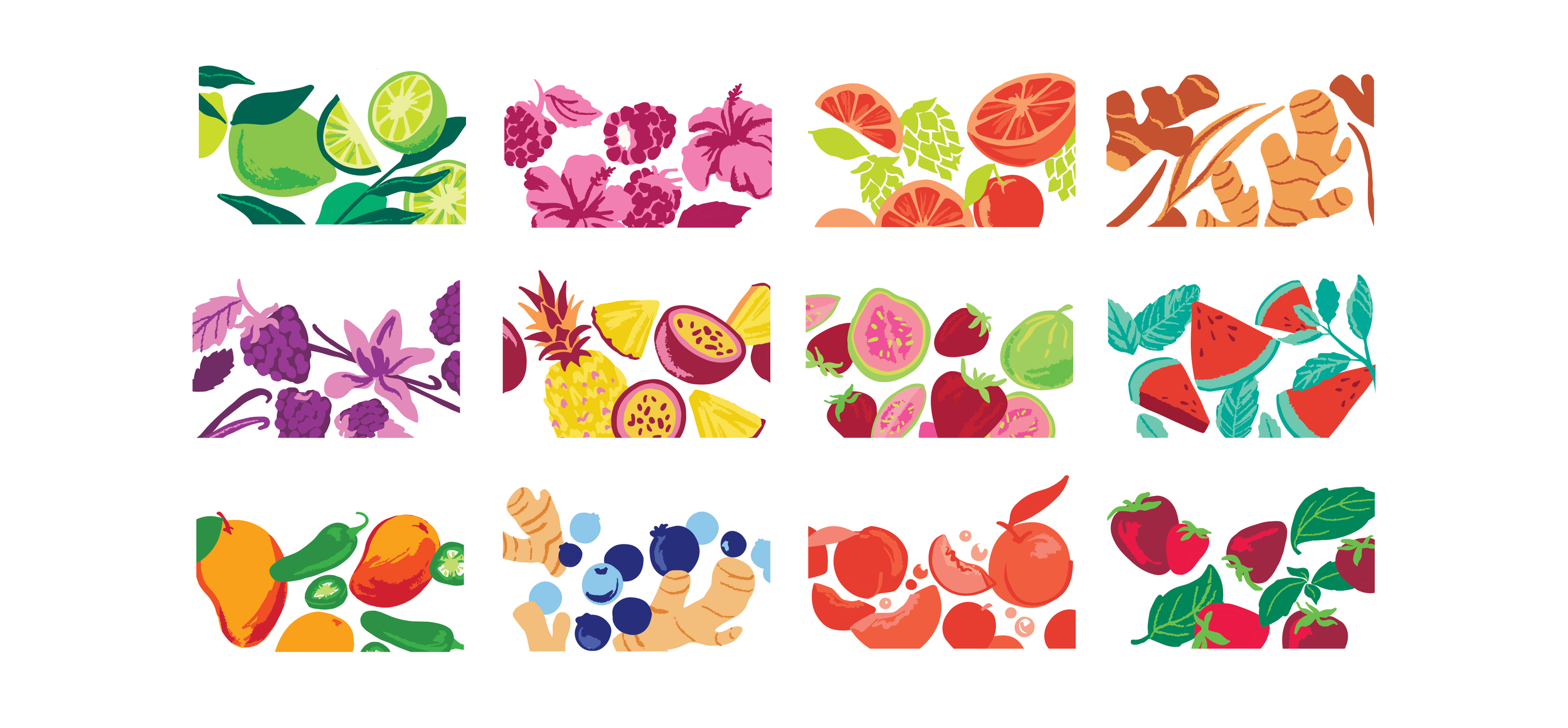
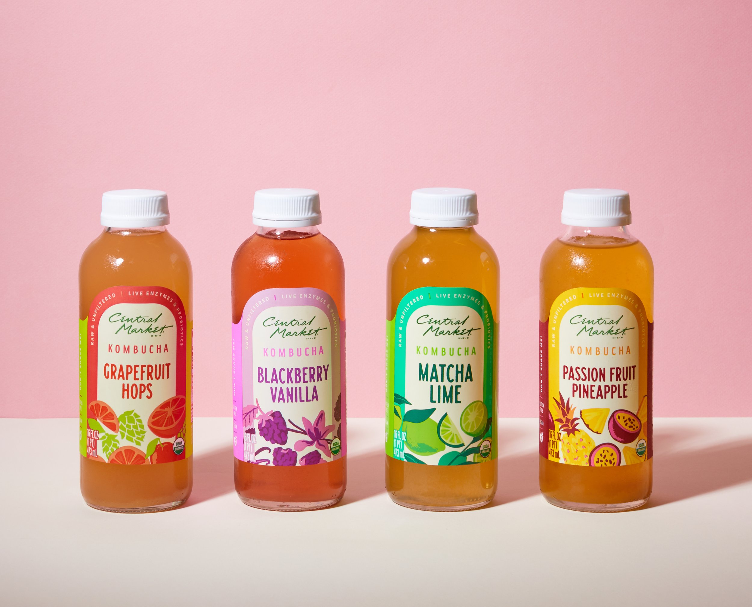
The Central Market team reformulated their line of kombuchas to provide new, distinctive flavors to customers, and they needed a label redesign that would speak to the vibrant new product. While the Central Market brand typically leans into softer palettes and delicate typography, it was important for this line to stand out amidst a busy, colorful set. We opted for bright hues and playful illustrations, but kept soft lines for the lettering and imagery to stay true to the brand’s handcrafted nature.

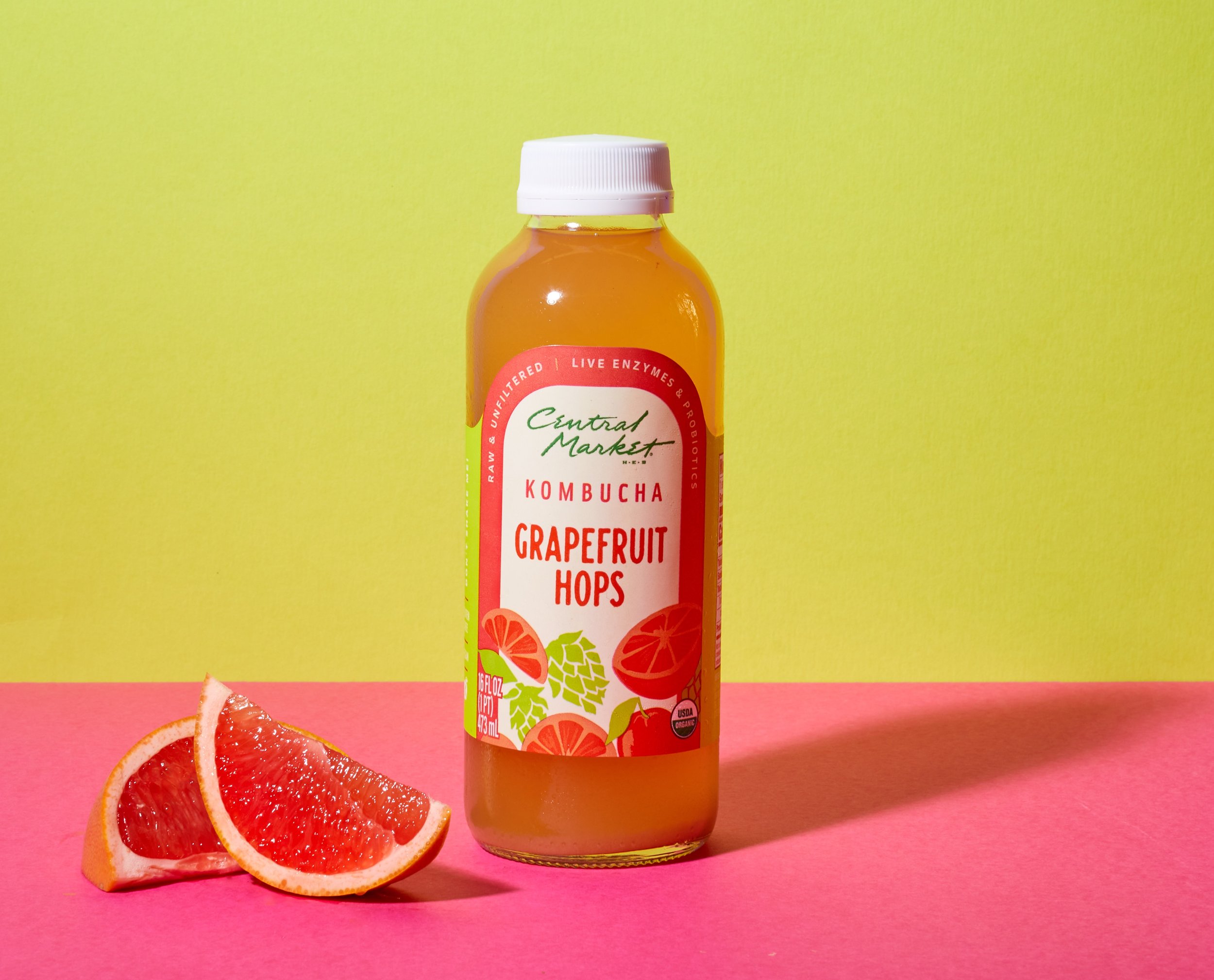
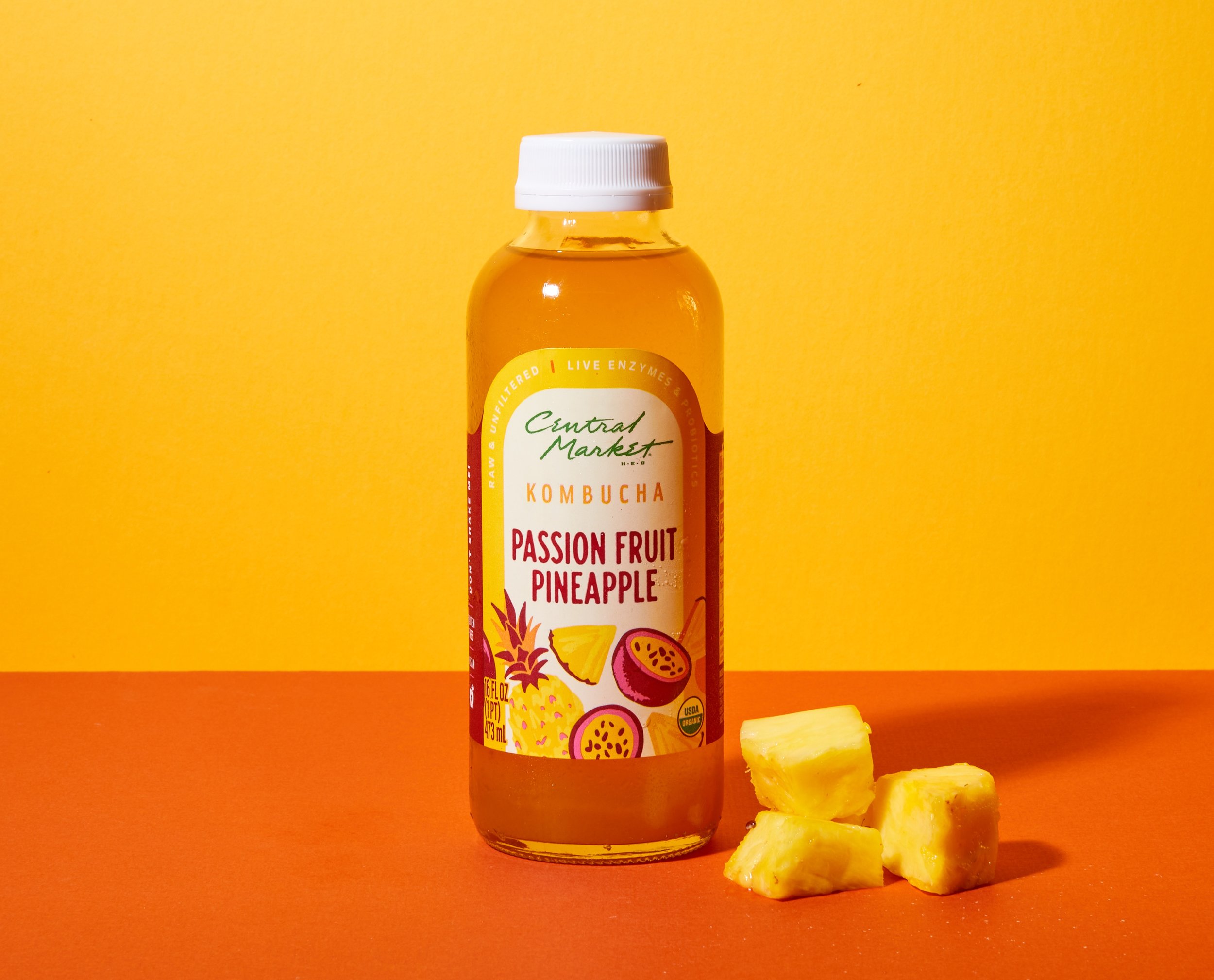
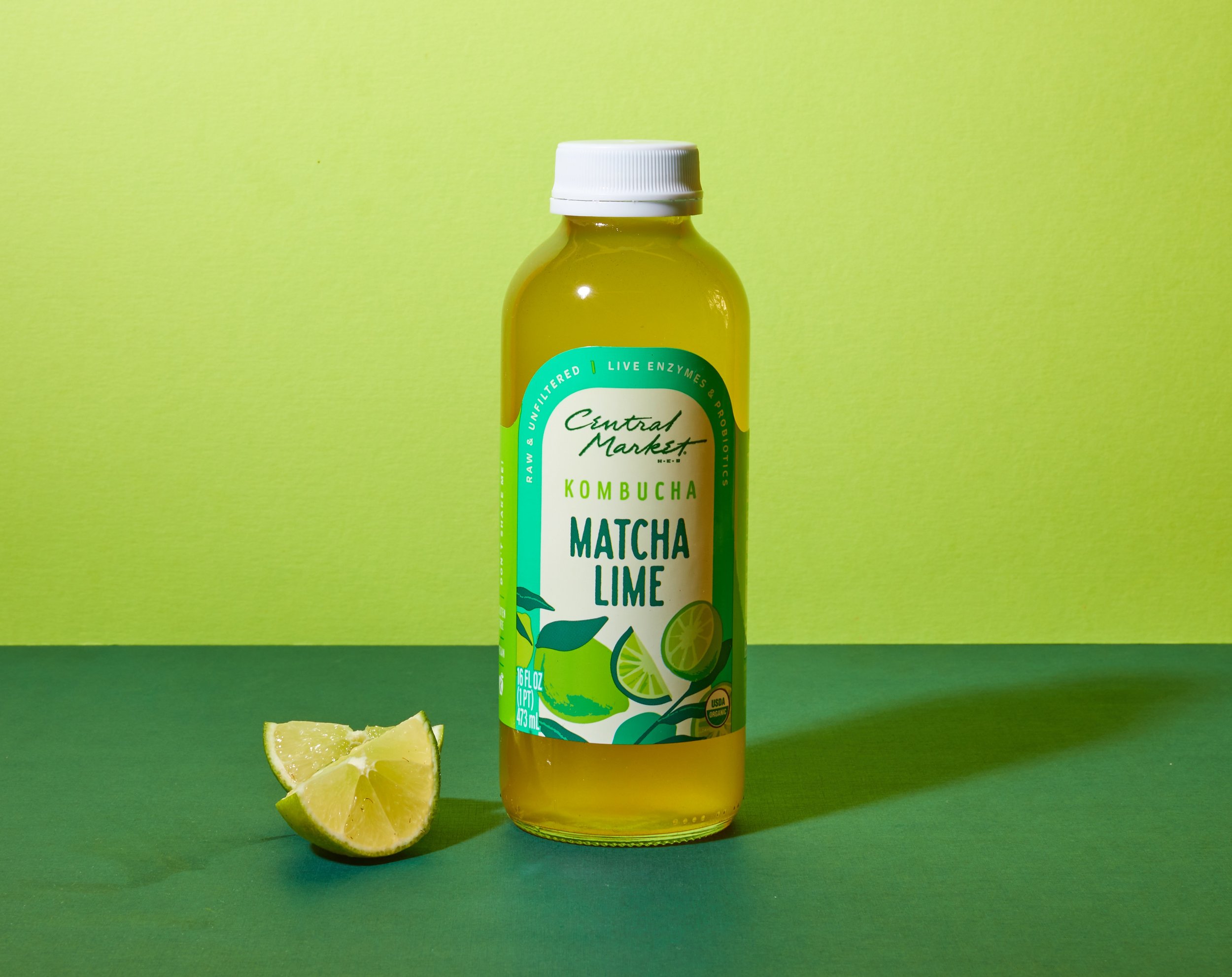
Since we were using a unique color palette for each flavor, it was important to establish some consistent elements that would tie the line together and create a cohesive presence at shelf. Early in the design process, we requested a custom die-cut label, eventually landing on the arched two-tone format seen here.
Photography by Willa McDonald
The relaunch consisted of twelve different flavors (and therefore twelve unique illustrations — shown below), each one living into a playful, dynamic style that mimics the bubbly, punchy nature of the beverage itself.
