Higher Harvest Branding
Early in 2021, the H-E-B team began researching the concept of a new health & wellness brand within the store. Over the course of several months, our team conducted customer focus groups and surveys to better understand the market and create an effective brand strategy. Part of this process was logo ideation, which resulted in the mark below.
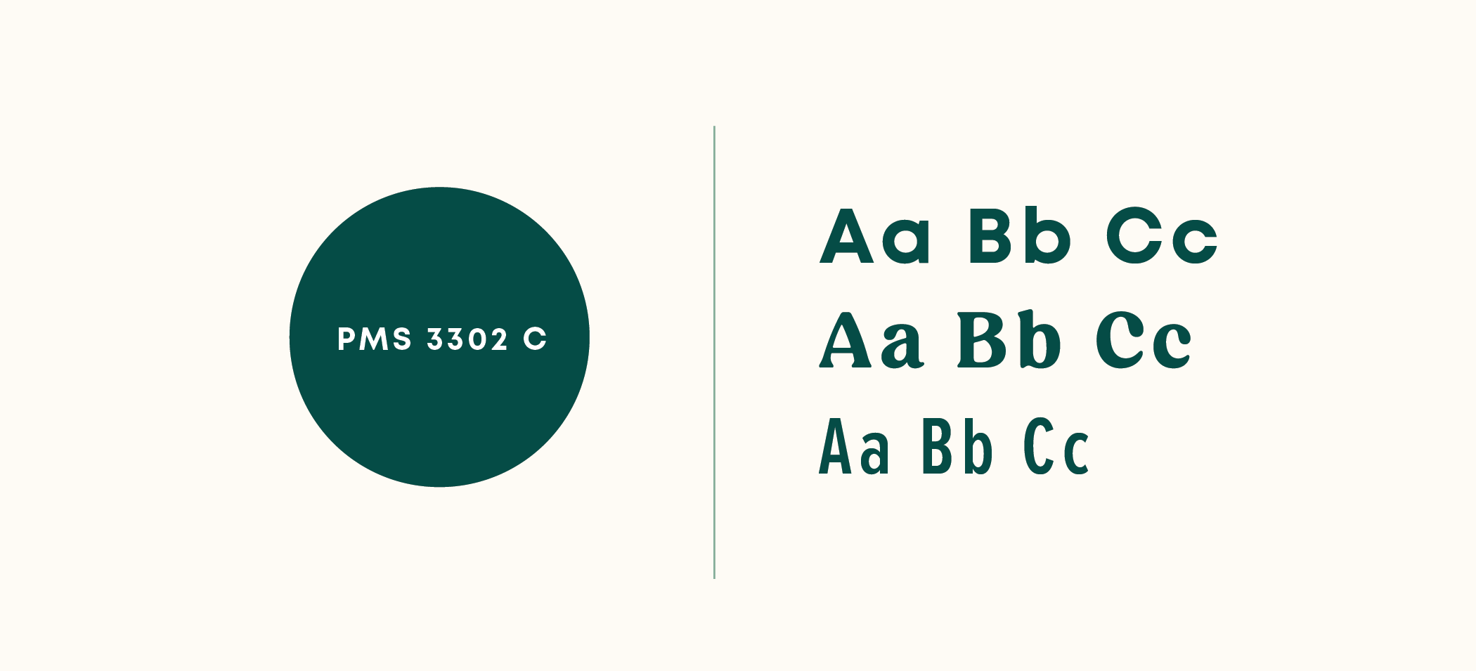
Our team proposed several logo concepts, but ultimately this mark was selected because it communicated the idea of wellness without feeling clinical. The hidden H’s in the sun’s rays speak to the level of detail with which ingredients in the brand are scrutinized, and the concept of a sun rising hints at the “higher” purpose of food as nourishment. Although we looked at several color options for the brand, we ultimately landed on this deep green Pantone as it felt like a natural connection to the health space (but is dark enough to act as a neutral within the palette).
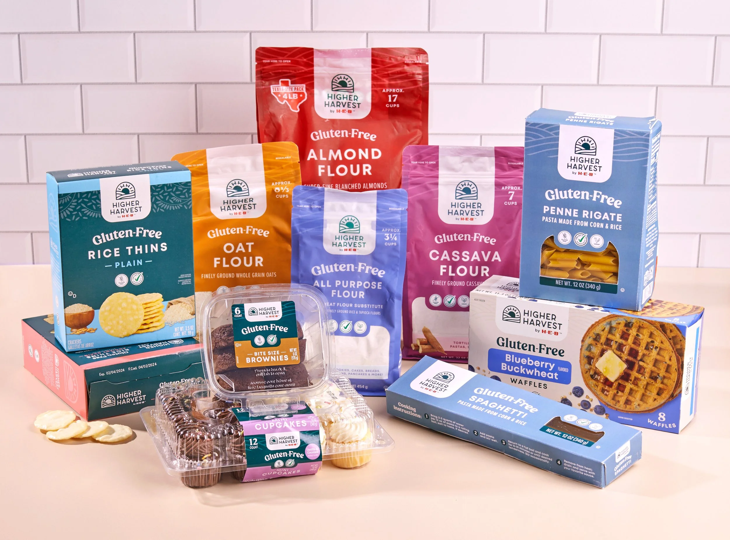
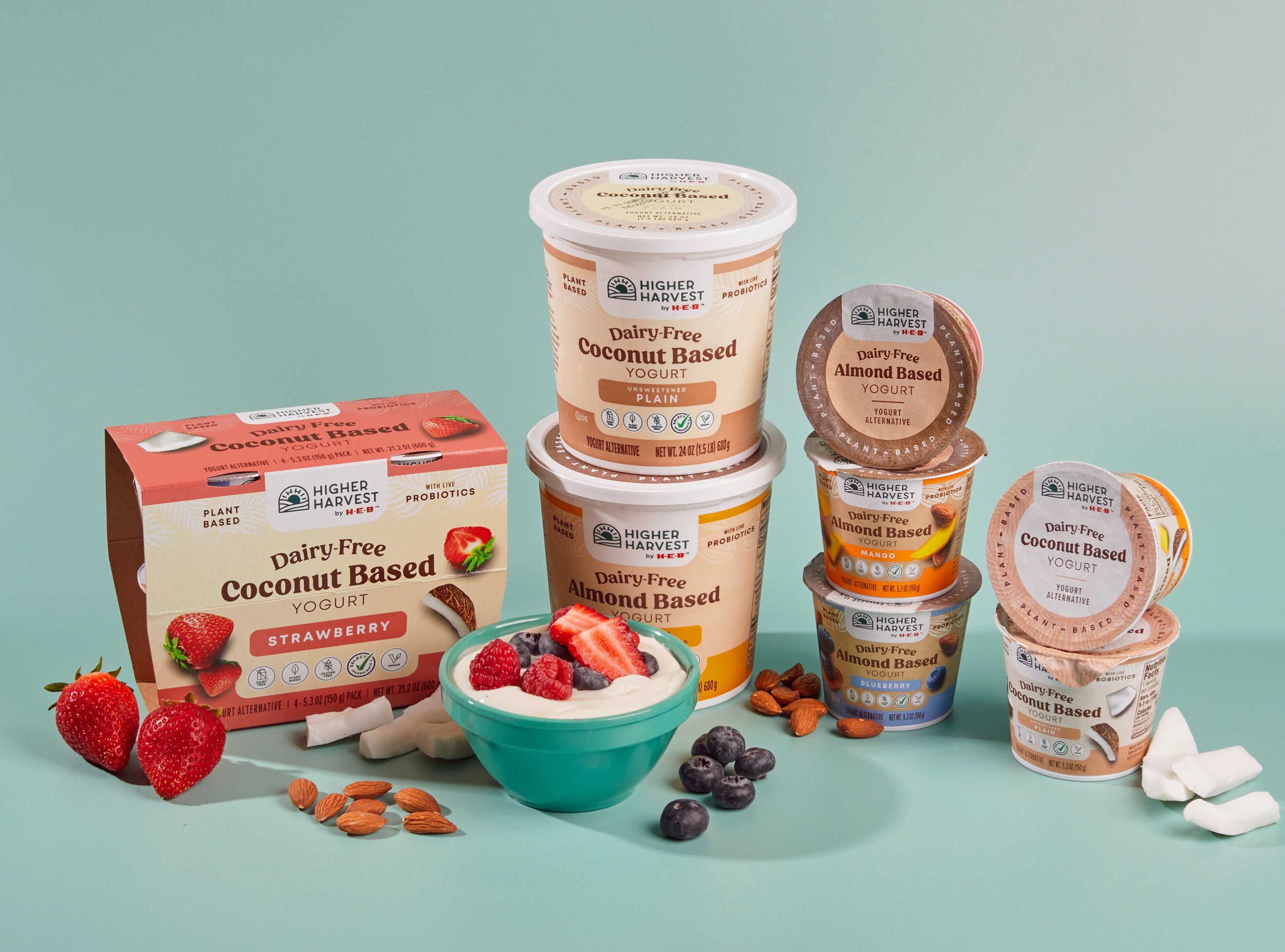
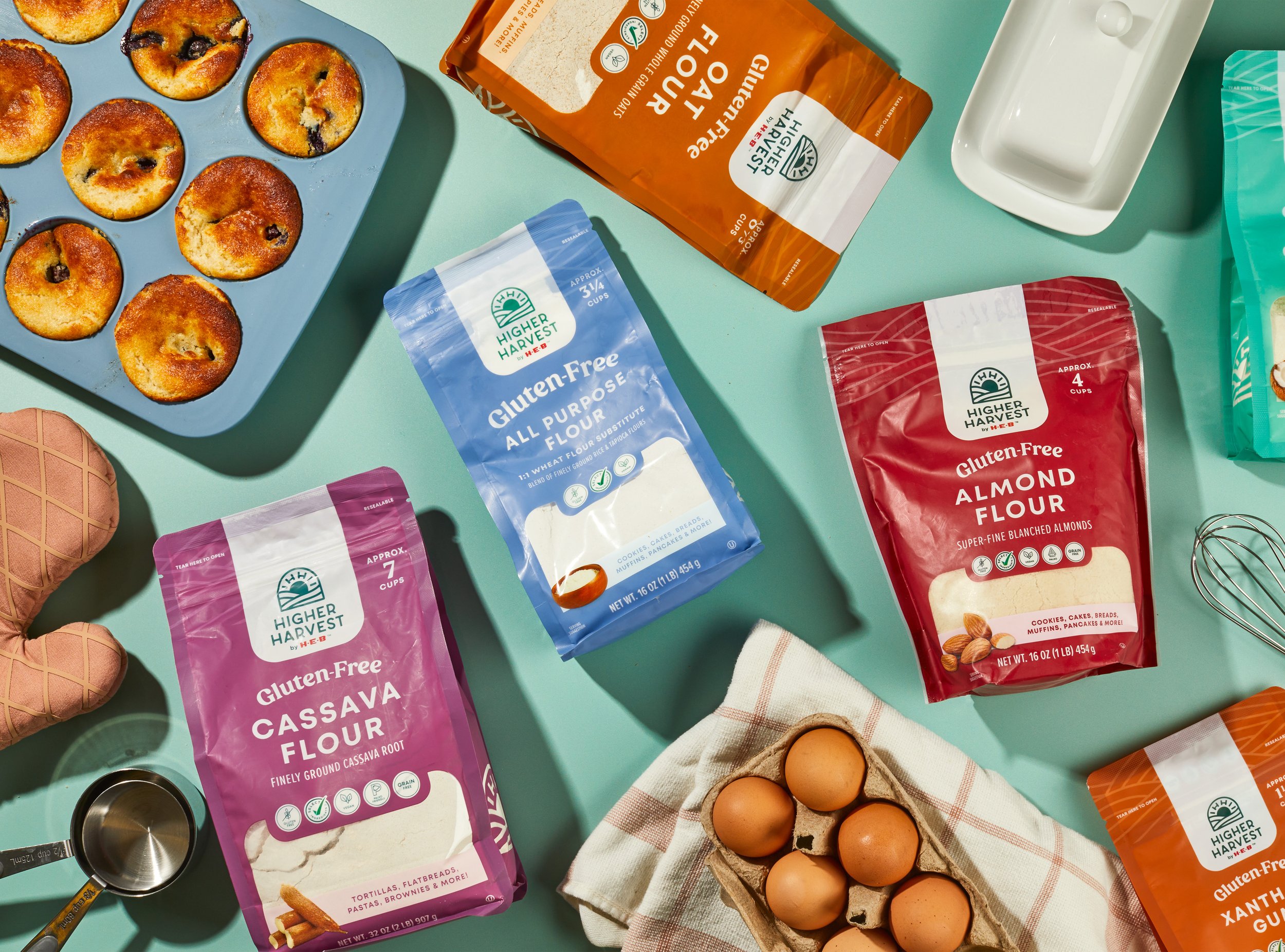
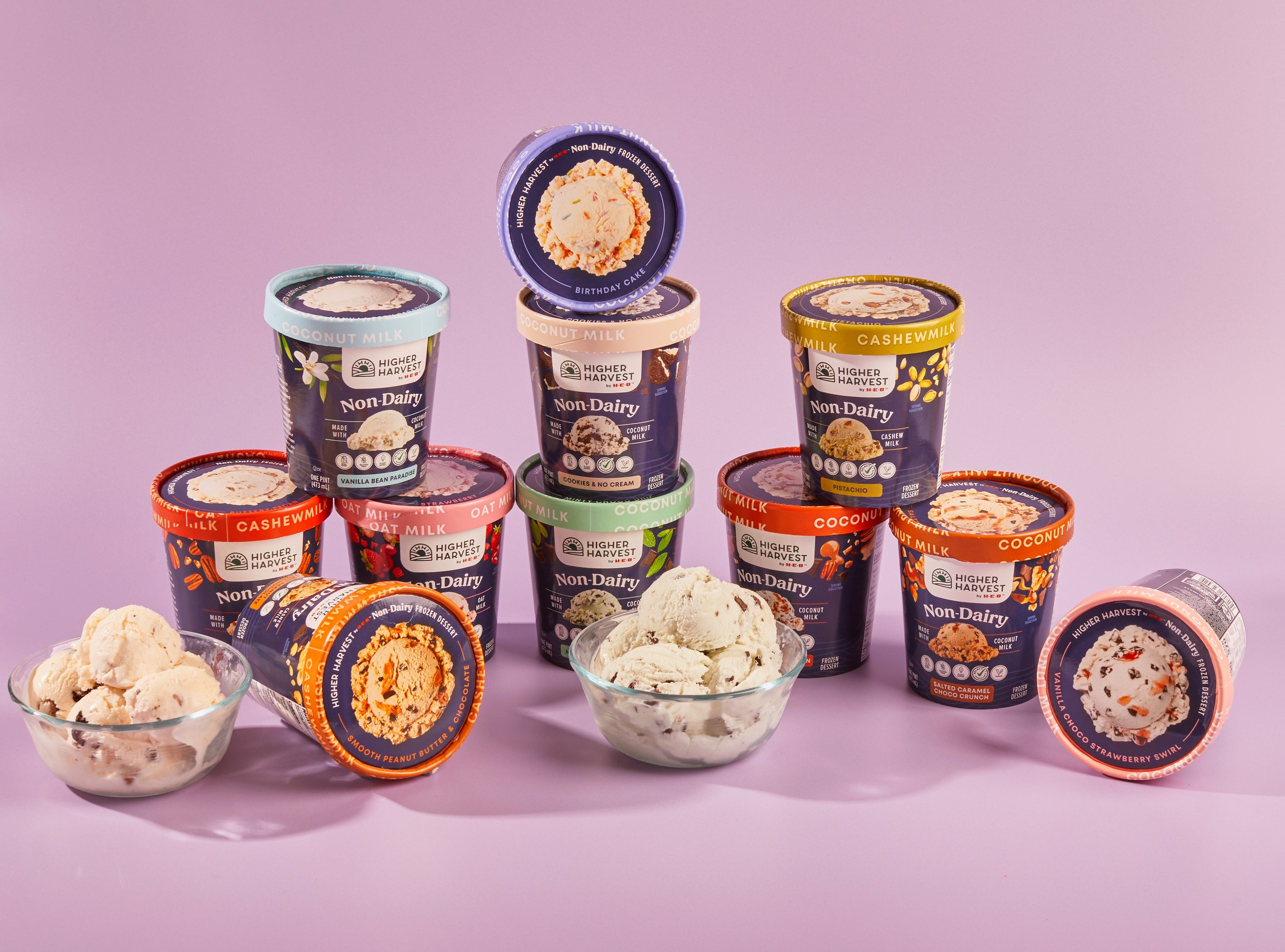
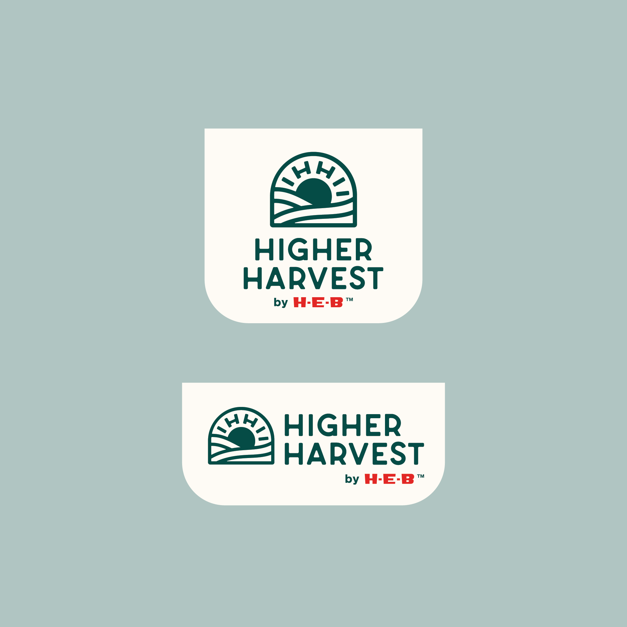
While our style guide needed to be consistent enough to create brand recognition across the store, it was also important to leave flexibility, so the brand could serve each category’s unique needs. One of the key elements of the brand is the white tab which drops down from the top of each package. By keeping the logo in this neutral container, and always in the same color, we established a focal point for customers to easily identify the Higher Harvest brand throughout the store. This gave each team the freedom to explore unique color palettes, patterns, and other supporting elements for their specific products.
