RecyclHers Branding
It’s always rewarding to work with clients who have a special purpose behind their project, and collaborating on the RecyclHers brand was a prime example of this. Two friends approached me with the vision of creating an organization that championed recycling and sustainability, especially among women, and soon RecyclHers was born. The nonprofit exists to educate individuals on recycling responsibly, and also to empower other methods of living sustainably.


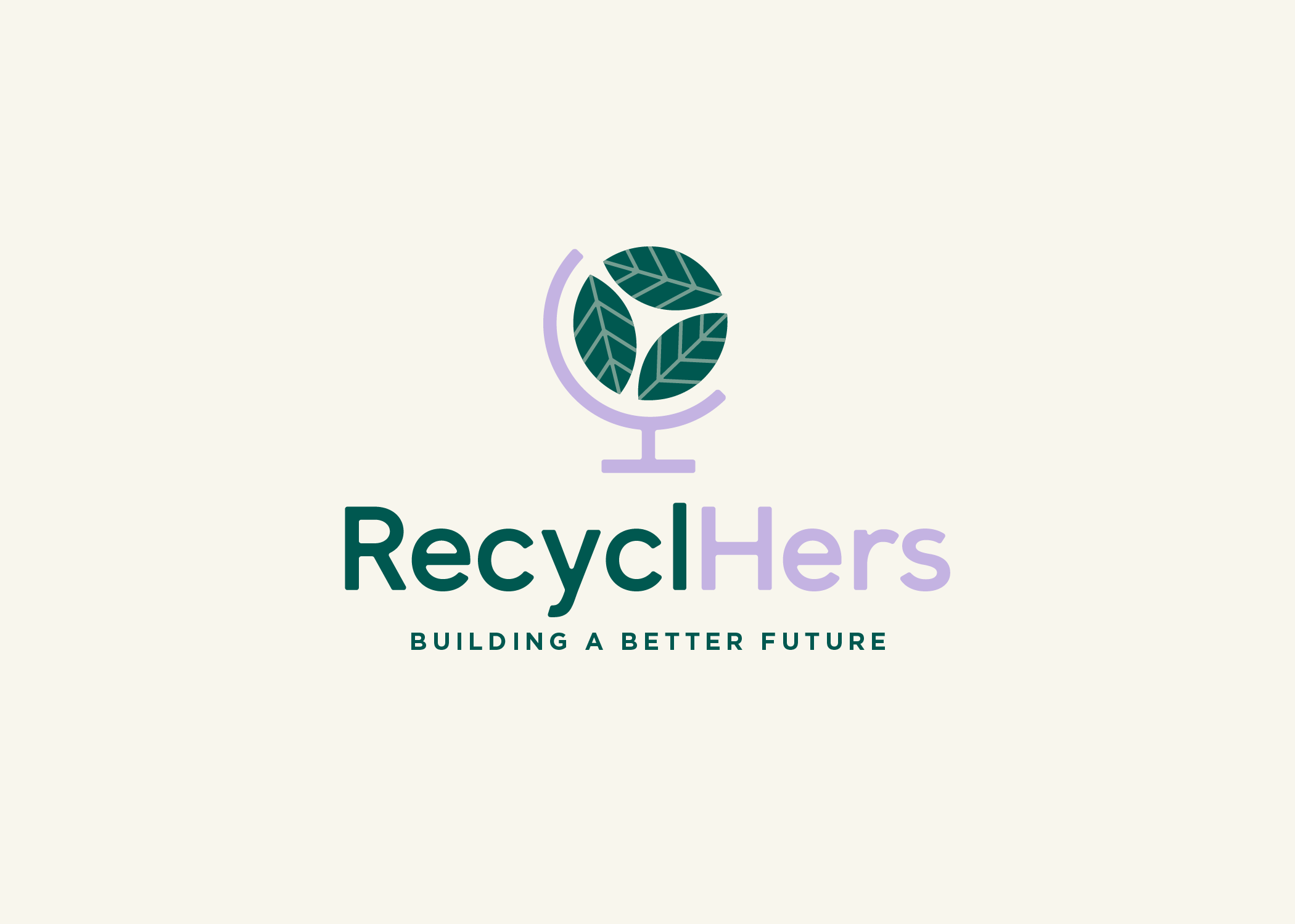
We explored several potential marks for the logo, trying to land on an icon that communicated the idea of sustainability and a circular economy (without using the familiar chasing arrows symbol). Ultimately, this icon was selected as a nod to both of those themes, with the globe shape also speaking to the idea of education. A clean, bold typeface mimics the lines of the icon and keeps the mark feeling unified, while the use of sentence case and slightly-rounded corners helps the brand feel approachable and fresh.

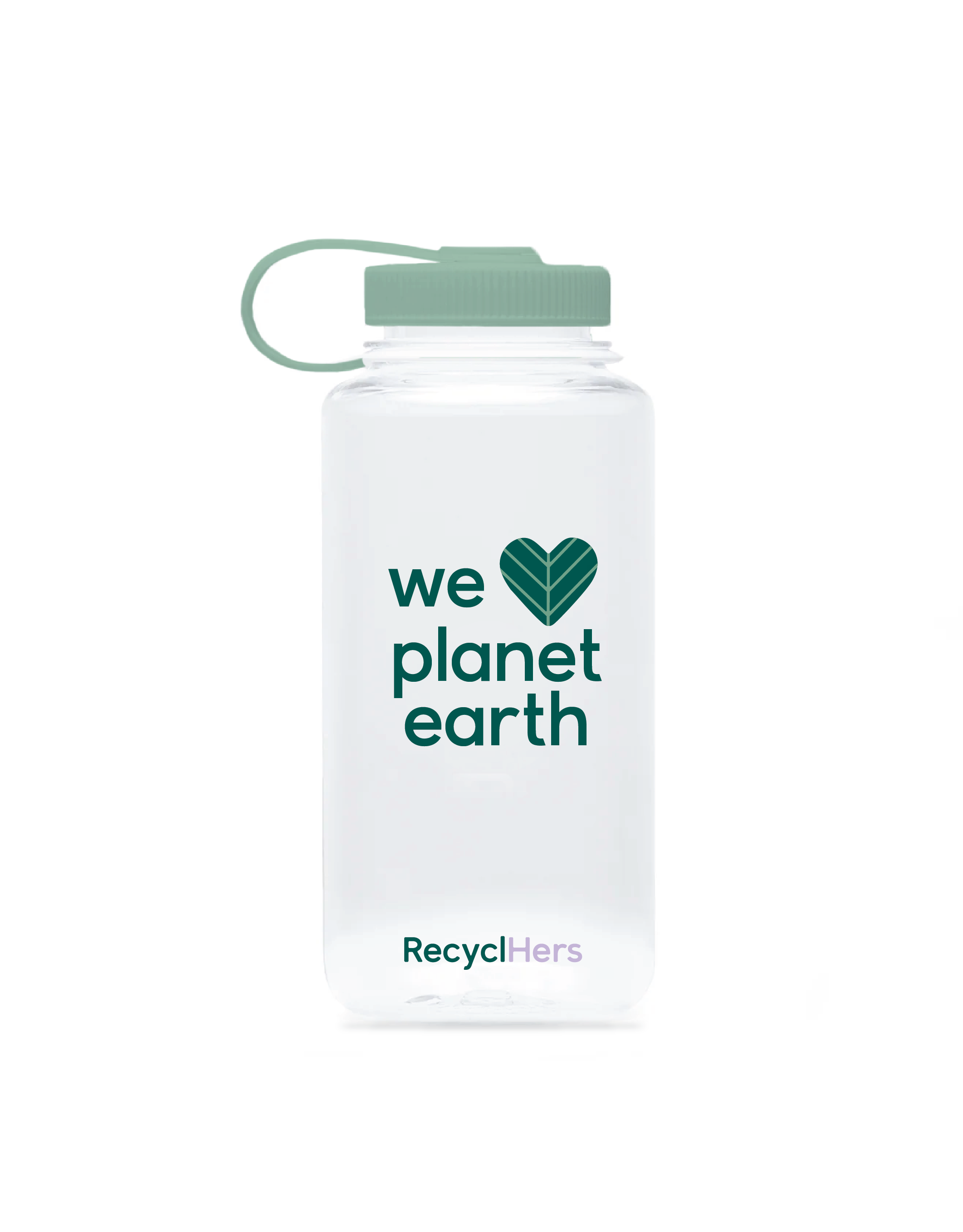
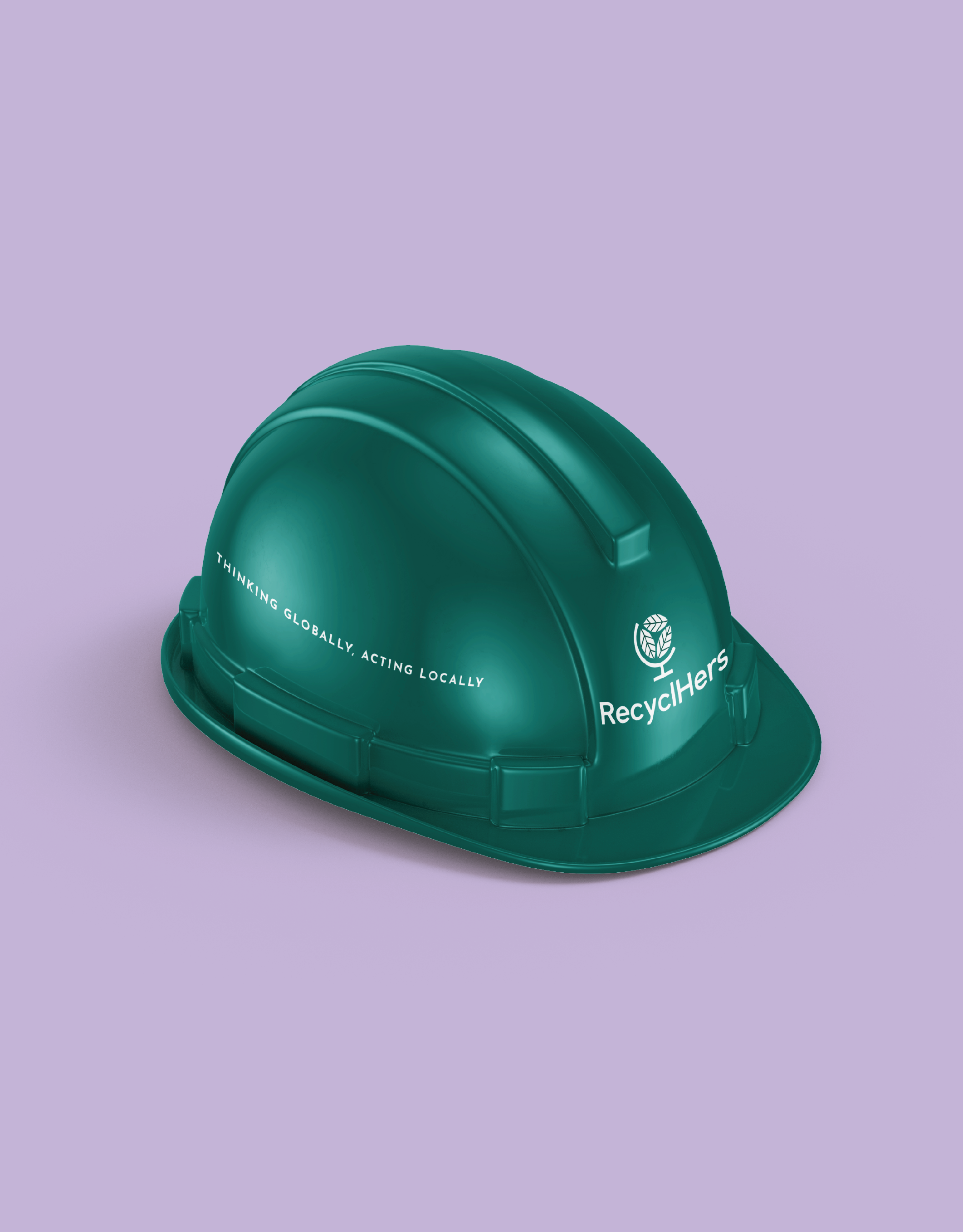
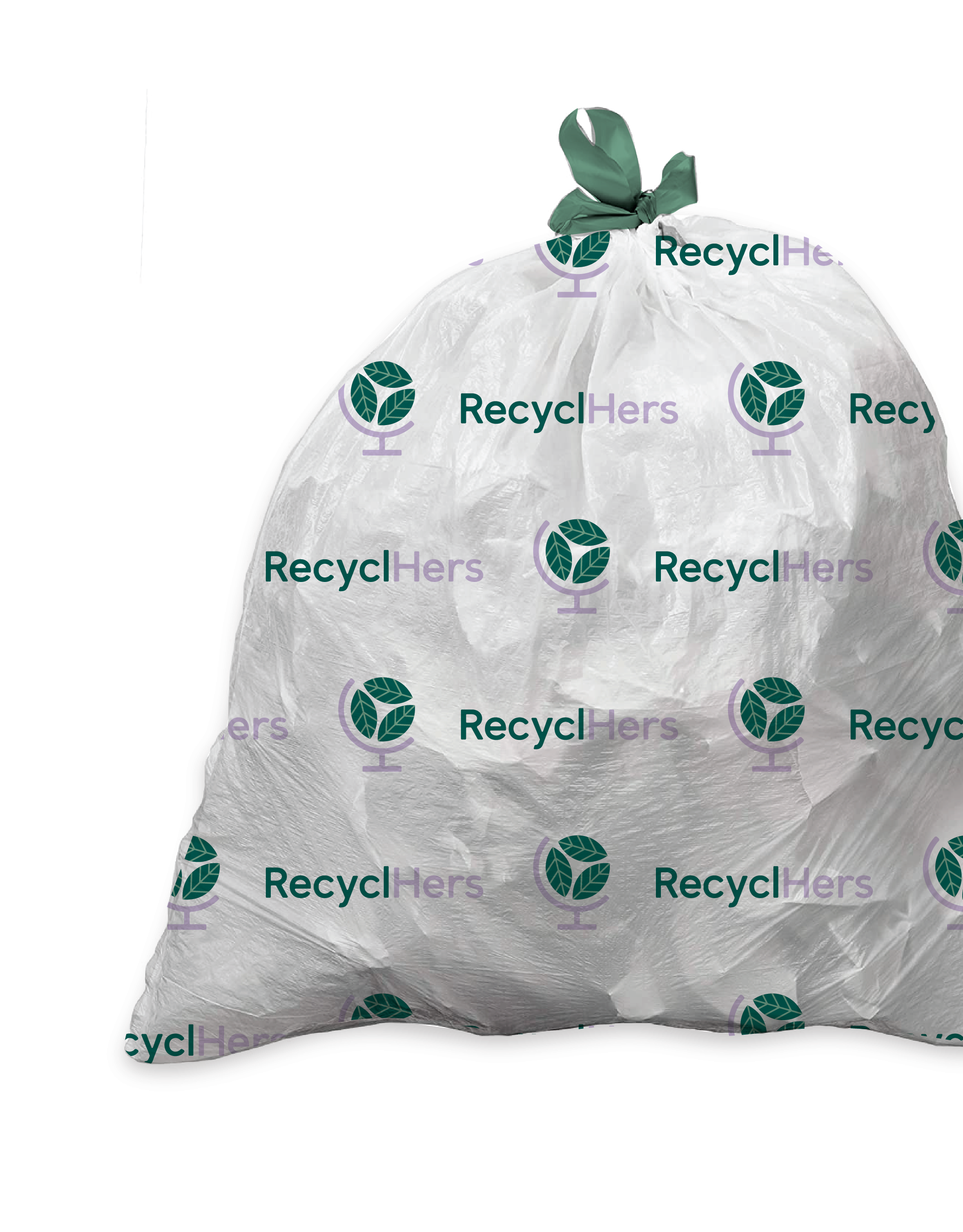
My clients had a long-term vision of extending their brand to different types of merchandise, so I supplied some preliminary mockups to get them excited about the possibilities. A tight color palette worked best here, with the lavender working as an unexpected accent to the more traditional green hues found in this industry.


